¶ What is the dashboard?
The dashboard is the primary risk reporting and auditing tool in Diri. The dashboard provides basic visualisation of aggregated data that your user has access to. The data is visualised using risk assessment tools such as the risk matrix and basic statistical tools, such as pie and bar charts. You can use the dashboard to keep track the organisational risk picture, work progress, and other data Data collected in Diri.
¶ Dashboard configurations
A dashboard configuration is bound to two things:
- Module - Each module has a separate dashboard.
- Organization - For admin and priviledged users with options to change active organization, dashboards configurations are also separate per organizational branch.
¶ Configure the dashboard
The dashboard comes with a basic set of tiles containing various information and customizable cards. Clicking the configure icon, upper right corner, opens the dashboard configuration menu:
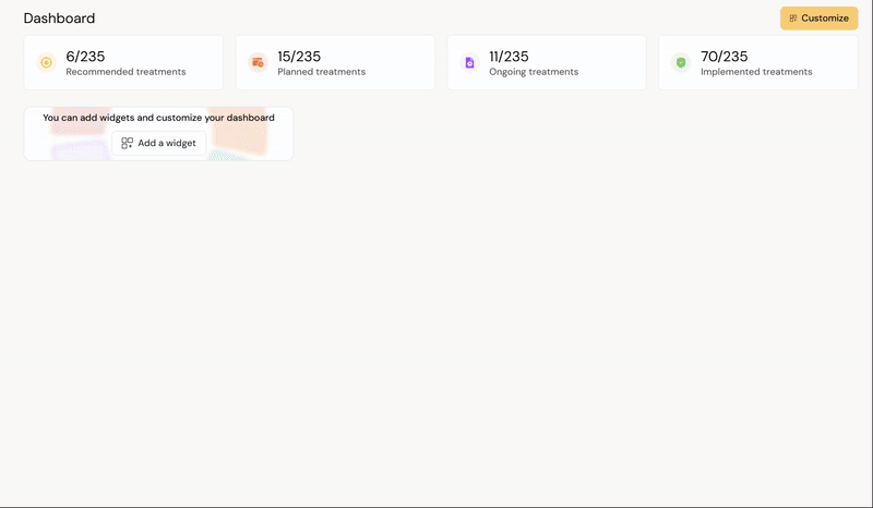
The dashboard configuration is a Drag-and-drop menu where you can place the dashboard cards as you wish. To add, delete, or edit a card, go into customize mode, hover the mouse pointer over the respective card to show the edit and remove icons.
¶ Customizable dashboard cards
In theory, all the data collected in a standardised format in Diri can be visualised in the dashboard. All new users are provided with a default dashboard layout. New customizable dashboard cards are being introduced, intended for advanced users, based on basic statistical visualizations. Cards can be added by selecting the "Customize" button and using the familiar drag-and-drop functionality.
A new feature allows each card to be assigned a custom title and description, and the width and height can now be adjusted individually.
¶ Customized Risk Matrix

Color codes and level names are configured under Settings, as before. To add a risk matrix, select Customize, add the matrix to the dashboard, and hover the cursor over the card. Then click the settings icon (as shown in Figure 5). A configuration menu will appear on the right side of the screen. Here, users may define the title, subtitle, width, and height of the card, as illustrated in Figure 6. It is also possible to filter which risk assessments should be displayed within the matrix.

¶ Dashboard Cards for Tables
It is now possible to add tables containing content to the dashboard. From the right-hand menu shown in Figure 5, select "Table". This will add a new dashboard card that requires configuration, as illustrated in the below figure.

To begin customization, click the configure icon. Users can set a title and description for the table and retrieve data from the various available sources in Diri. The table columns are fully configurable. Users are encouraged to experiment with content, height, and width settings to find the optimal layout, as shown in the below figure.

¶ Dashboard Cards for Basic Statistics (Advanced Users)
Diri now offers three types of standard statistical dashboard cards: line charts, pie charts, and bar charts. All cards support customizable titles, subtitles, width, and height. In addition, users can retrieve data from selected data sources and apply filters to various variables. This functionality is intended for advanced users who work with well-structured data and have specific analytical needs.

¶ How to create a compliance dashboard in Diri
A compliance dashboard is great for tracking progress in your information security work and the information security management system in general. Diri facilitates customization of dashboard cards to pull the data you want to visualize and show it in a bar or pie chart. Make sure that the treatments you want to visualize match the selected module in the dashboard.
¶ Creating a pie chart for treatments

The above example show cases a setup for treatment statistics based on implementation status. The premise for building a statistical chart such as this is that the treatment class and status are categorized. As illustrated below:

Status, Class, and Type are highlighted as categorical variables well suited for pie and bar charts visualization. Similar variables are found for most items in Diri and can be used as described below.
To create a dashboard widget for measuring compliance, we move to the dashboard and click “Customize”, select the pie chart-widget, drag and drop it where you want it in the dashboard.

Click on the cog wheel to customize the widget and open the Configuration setting. Put the title and descriptions you want to use for the widget.

Resource indicates which primary item to get your variables from, select “Treatment”.
The “Group by” chooses the primary variable to draw from Treatments. Selecting one variable is enough to draw a diagram successfully, e.g. status will display the implementation status of the treatments in percentages.

The configuration panel on the left determines how the treatment status is displayed in the pie chart on the right. By sorting on a specific variable, we can visualize the implementation status for particular treatment types or classes.
- Resource specifies the primary data source for the chart.
- Group by defines which variable the treatments are grouped or aggregated by. Implementation status in the example
- Property provides an optional secondary sorting variable.
- Condition determines whether the selected property should include or exclude a specific type or value.
This configuration allows you to visualize progress or status across different treatment groups in a clear, comparable way. In the below example, treatments are chosen as the resource, implementation status as the property, and type containing technological as the condition of inclusion:

Depending on which variables you want to display for your compliance, you can make new widgets for comparison or reporting.